
Saturday, 6 November 2010
Dots & Spots
This card was made for a competion on one of my Yahoo groups, the theme being dots & spots. The background was done using a couple of colours of Adirondack Colorwash Sprays through sequin waste, which I moved around as I sprayed. That background sat in my drawer for quite some time just waiting for an opportunity to use it - I liked it too much to waste it on something that didn't deserve it - LOL! The butterfly was stamped on vellum and then decorated (dots and spots!) with a marker pen before being placed on top of it's shadow and having it's wings lifted. The flower is from Purple Onion Designs.

Tuesday, 2 November 2010
A tutorial - Colourwash with Salt
I have produced a (apologies for the very poor & yellowy photographs!) tutorial for the November Monthly Art Technique on the Arttechniques Yahoo Group which I thought I would post on the blog as well. Maybe it will useful information for someone!
Colour Wash with Salt
Supplies:
Water colour paper
1, 2 or 3 Water colour paints – depending on the look you want to achieve
Large (for water) and smaller (for paint) flat brushes
Rock salt / granular salt
Gesso (optional)

Using the larger brush, liberally brush the paper with clean water and then, using the smaller brush, lay on the lightest of your coloured paints.

Whilst still wet randomly lay on the other colour/s of paint

Brush over more water to blend the colours together, but don’t overdo it, you need to have some definition between the colours.

Sprinkle with the salt and leave to dry

The salt working:

Once fully dry brush the salt off of the paper and it’s ready to use.

If using bright colours as I have here (mainly for demo purposes) you can mute the brightness by brushing with some watered down gesso (about 50/50). Work gently and quickly so that you don’t disturb the colours in the underneath layer.

Leave to dry, flatten under heavy books if necessary.
ATC made using this background effect – over-stamped with light grey and green inks.

I followed this by using a light liquid blue water colour paint and salt from my salt grinder (don’t let on to DH – kitchen supplies are NOT meant to go into my craft room – LOL!), which gave a random effect with small and teeny weeny grains of salt. The colour is actually a lot better than it looks here; a pretty pale blue without the yellow tinge!

I made the card below using this background:

If you’ve got this far, thanks for looking! I do hope that you have enjoyed this technique and will give it a go.
Wednesday, 27 October 2010
A Card for my Mum
It's mum's birthday on 7th November so I made this card for her. The paper is from a Laura Ashley block.


Wednesday, 20 October 2010
A Junky Card
I am a member of a local craft group where we have a competition at each monthly meeting. The October competition was to make something using junk. After a quick hunt around I decided that the junk I had most of was wine labels, corks, foils etc (hic!) so I set to making a collage. It needed something to finish it off and I found the perfect thing on a visit to a pub in London - they had postcards advertising a make of rum and the bottle was just the right size to sit neatly on the edge of the card. (My son did query why I was hiding a stash of postcards in my bag! They were free .....!). Tying some shrink plastic tags around the neck of the bottle finished it off nicely. OK, so I didn't win the competition but I am really pleased with the way the card came together.


Carrying on the Catch Up
A couple more swaps I've taken part in are ......
...... an ATC wap with the theme 'Women'. I chose to do a grungy background and topped it with a Mona Lisa image stamped on vellum. The braid and flower with gem were added to give a more feminine touch.


Mushrooms and Citrasolve
Last month I was asked by one of the ladies in the Hearts in Touch group how I used citrasolve with the National Geographic pages. I need to mention that it was Adrienne Goodenough who first mentioned this technique on one of my groups, and it's a great one. I added my own twist by gently scrubbing off some of the colour with a small stiffish paintbrush and then adding shading and colour using watercolour markers.
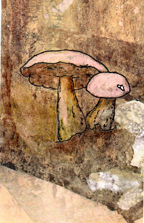 I didn't actually need to do much to this to make it look like a woodland scene; the path (or I guess it could be a river with reflections in) and the white 'rocks' were already there as was the 'fallen log' in the background. I shaded the base and underneath the mushroom caps then ran a bit of brown up the left side to look like a tree.
...... an ATC wap with the theme 'Women'. I chose to do a grungy background and topped it with a Mona Lisa image stamped on vellum. The braid and flower with gem were added to give a more feminine touch.

The other swap was with the Oriental Stamp Art group, I decorated a plain notebook, inside the covers as well as outside. It turned out really cute - seemed a pity to give it away!

Mushrooms and Citrasolve
Last month I was asked by one of the ladies in the Hearts in Touch group how I used citrasolve with the National Geographic pages. I need to mention that it was Adrienne Goodenough who first mentioned this technique on one of my groups, and it's a great one. I added my own twist by gently scrubbing off some of the colour with a small stiffish paintbrush and then adding shading and colour using watercolour markers.

Tuesday, 19 October 2010
Catch up Time!
How did it get to be October, and the middle of it no less? I think it's time to do a bit of catching up. Although I haven't actually done a vast amount of art work over the past couple of months I have had a few sessions playing around with various background techniques, throwing paint and ink around and generally making a mess (no comments please Karen, Sy or Wendy LOL!!).
One project I took part in earlier in the year was a calendar to be sold in aid of 'Go Red for Women' an American Heart Association initiative. I am a member of the Lost Art Creations Yahoo Group and Terrie, the owner, organised this. The rules were that each calendar page had to contain at least one image and one 'pretty bit' from her Etsy shop and have a heart somewhere on it. I made the page for March:
 Terrie has printed and bound all the calendars and they are now on sale - I am proud to be a part of this, and excited to think that a piece of my artwork may be gracing many walls during the month of March 2011! Many of us are raffling off our original artwork for this too, with all proceeds going to the charity.
A couple of months ago I took part in a gothic arch swap where 12 of us made double-sided pages to be made into a book. This was good fun - I got lovely and messy with the blue and black inks (which stayed on my fingers for a good two days, despite all my attempts to get it off, I think there was just tooooo much of it!). There were some absolutely gorgeous pages made by others taking part - mine is below:


One project I took part in earlier in the year was a calendar to be sold in aid of 'Go Red for Women' an American Heart Association initiative. I am a member of the Lost Art Creations Yahoo Group and Terrie, the owner, organised this. The rules were that each calendar page had to contain at least one image and one 'pretty bit' from her Etsy shop and have a heart somewhere on it. I made the page for March:

A couple of months ago I took part in a gothic arch swap where 12 of us made double-sided pages to be made into a book. This was good fun - I got lovely and messy with the blue and black inks (which stayed on my fingers for a good two days, despite all my attempts to get it off, I think there was just tooooo much of it!). There were some absolutely gorgeous pages made by others taking part - mine is below:

Front. The gravestone flap folds down and the verse behind it is:
Step into the darkness
Say goodbye to the light
We live in an eternity
Where every day is night
I can't give credit to the originator of the verse as I found it on the internet - but I did think it went particularly well with the theme.

Back
Oh to have some Copic Markers - I had one tiny Sharpie in the right colour purple/blue and wore it out doing all the pages, and the colouring in leaves a bit to be desired - it shows up worse on the photo than it did in real life!
Friday, 2 July 2010
A better tiger attempt ...... and he's a winner!!
I wasn't too happy with the previous tiger so, using yet more of my stash of glimmer misted c/s I tried again. This time I like it much better and all I did was to cut closer to the edges of the picture and colour the edges of the card with a black permanent marker. Layering onto corrugated c/s makes it look a much more masculine card so I guess this one will go in the drawer ready for one of the men in the family's birthday.
AND - this was was a winner! I entered it in my craft club's competition (theme - a technique) and it came second so I got a voucher for the craft shop - woo hoo! I'm doing a happy dance!!

AND - this was was a winner! I entered it in my craft club's competition (theme - a technique) and it came second so I got a voucher for the craft shop - woo hoo! I'm doing a happy dance!!

Subscribe to:
Posts (Atom)